Colors & fonts
Match your digital menu to your brand. Change your theme's background, text, and accent colors, choose a font family, and check contrast in the live preview.
Every theme comes with its own colors and fonts, and you can fine-tune them in the Studio editor's Styling mode to match your brand. Every change shows instantly in the live preview.
Colors
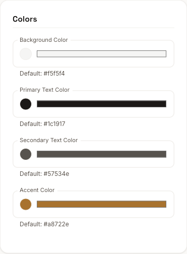
Each theme exposes a handful of color tokens. For most themes these are:
- Background color: the page behind your menu
- Primary text color: headings and item names
- Secondary text color: descriptions and supporting text
- Accent color: prices, dividers, and other highlights
Each field lists the theme's default value beneath it for reference, so you always know the starting point. Some themes include extra options too, such as a separate section background.
Fonts
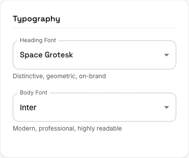
Pick a font family for your menu from the Typography section. Each option has a short description of its character, from a clean system default to friendlier, rounded styles, so you can match the tone of your venue.
Tips
- Keep strong contrast between text and background so your menu stays easy to read.
- Stick to one or two brand colors rather than many.
- Check the preview in both Mobile and Desktop before publishing.
When everything looks right, publish to push your changes live.